Intro
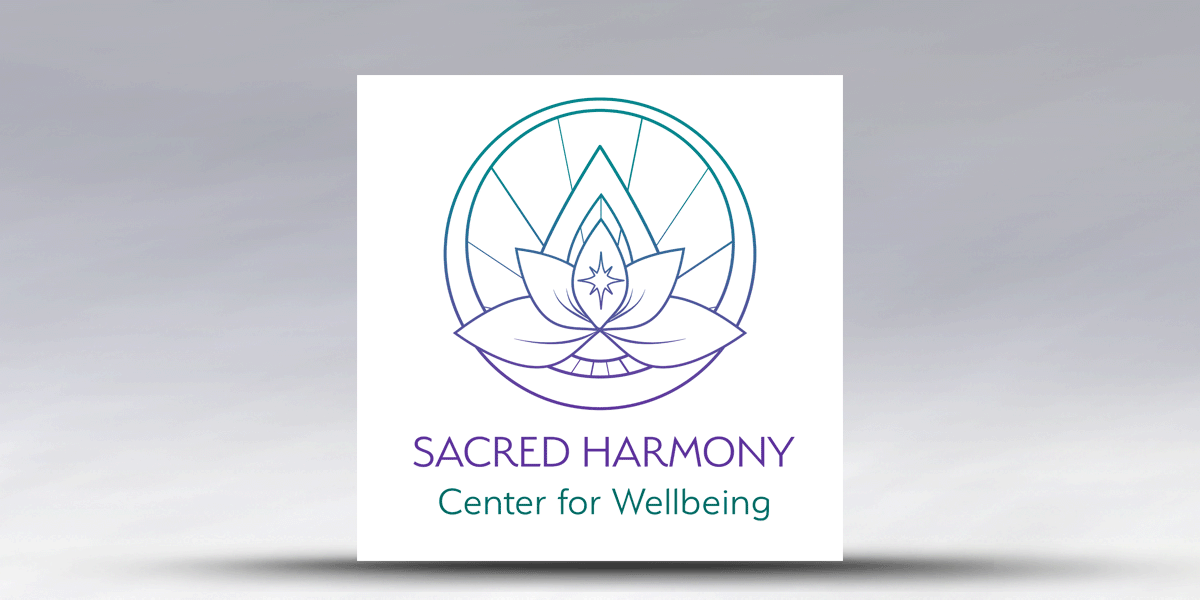
Sacred Harmony Center of Wellbeing is a woman-owned, LGBTQ+ small business. The owners and I co-created this logo to symbolize holistic healing with a focus on “light” and the “feminine.”
If you are in Winston-Salem, please stop by and say “hello,” or join their Sacred Harmony Community on Facebook.
The Process
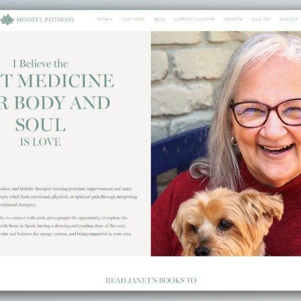
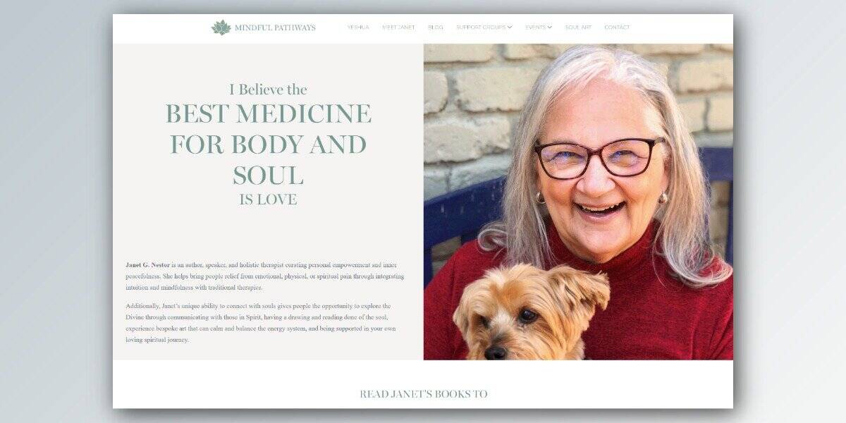
Sacred Harmony came to me through a referral from Janet Nestor. They had seen the logo I created for her, loved the work, and asked Janet to connect us. It was a wonderful way to begin a collaboration.
I started with a questionnaire, followed by a Zoom call to go over their responses and explore what they were looking for. What was immediately interesting was how much more emerged in conversation they were than on paper. The questionnaire gave me a starting point, but the real discovery happened through dialogue. They also shared a collection of logos they admired, which gave me valuable insight into their aesthetic sensibilities.
This was a new venture for both of them. One of the co-founders was still working at her regular job and the other was a stay-at-home mother which meant the business itself was still taking shape as we worked. That’s a big part of why we spent so much time in conversation before I began designing. Those discussions gave us the space to explore their vision more deeply, understand what the center would truly offer, and ensure the logo would reflect not just where they were, but where they were headed.
Once we were underway, they proved to be the most decisive and easiest clients I have ever had the pleasure of working with. They knew exactly what they liked and what they didn’t, which made the entire process a joy. I developed a range of logo variations that explored similar directions, and once they identified the one that resonated most, they provided feedback for refinements. From there we moved into something genuinely collaborative. We held a Zoom call together where I tried different design directions in real time while they guided me live on what was working and what wasn’t. That back-and-forth is what co-creation truly looks like in practice.
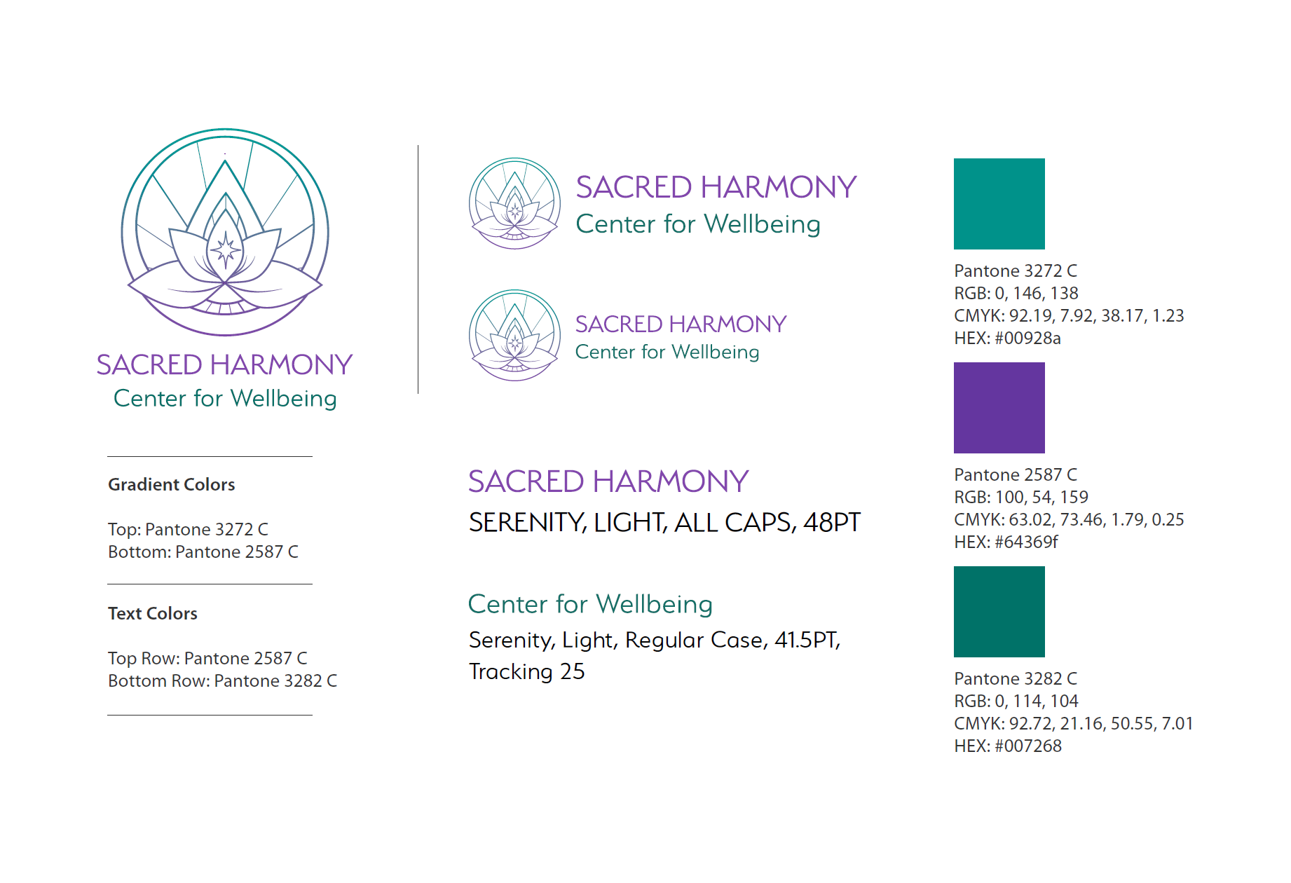
The final deliverables were: the logo in both horizontal and vertical text orientations, a full-color version, white, black, and grayscale variations, a simple brand guide, a secondary color palette file with complementary color options, and three abstract backgrounds they could use alongside the logo.