
Overview
Miorini Estate Planning Law Firm is a female-owned estate planning practice in Vienna, Virginia, serving families and seniors through life’s important legal transitions.
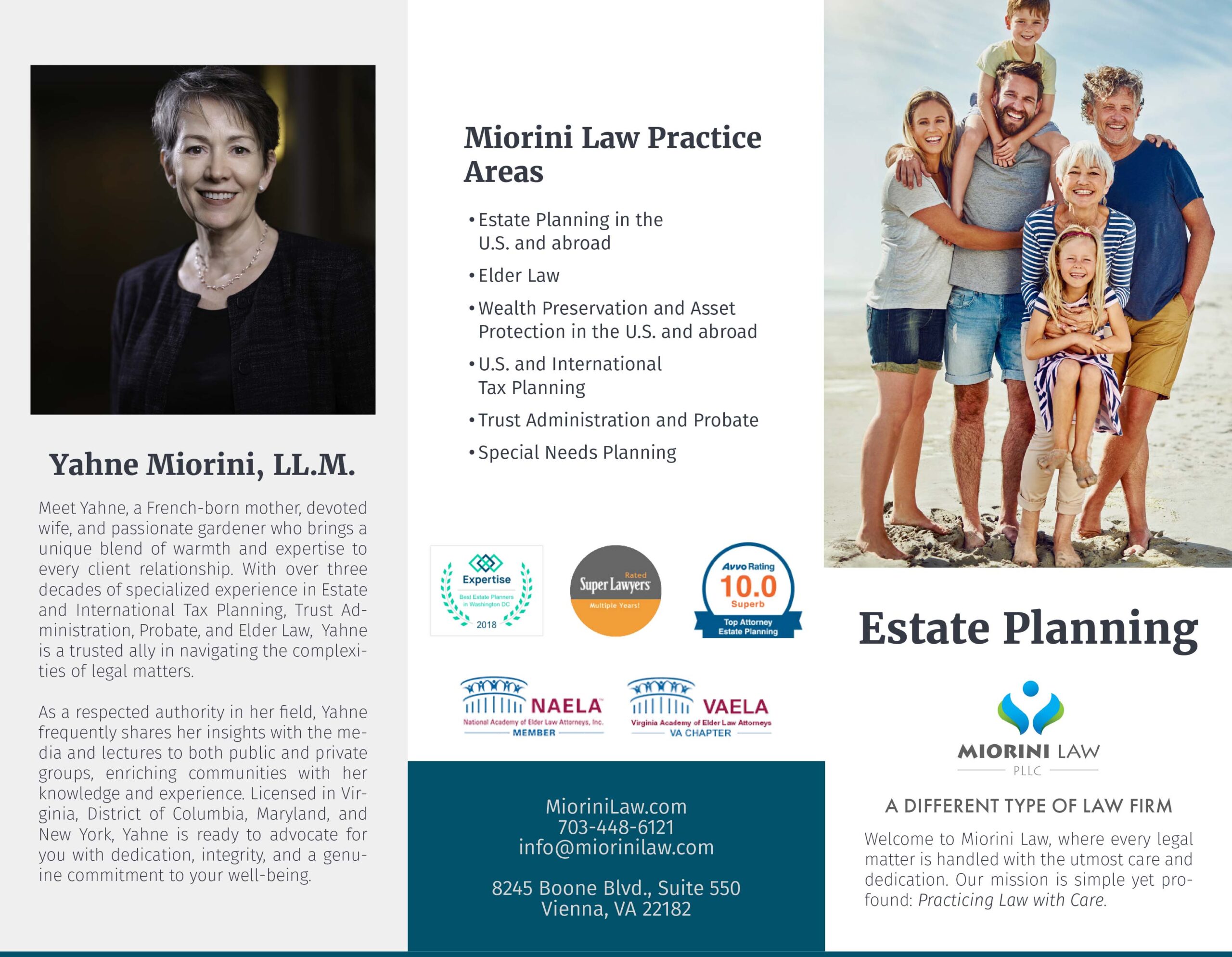
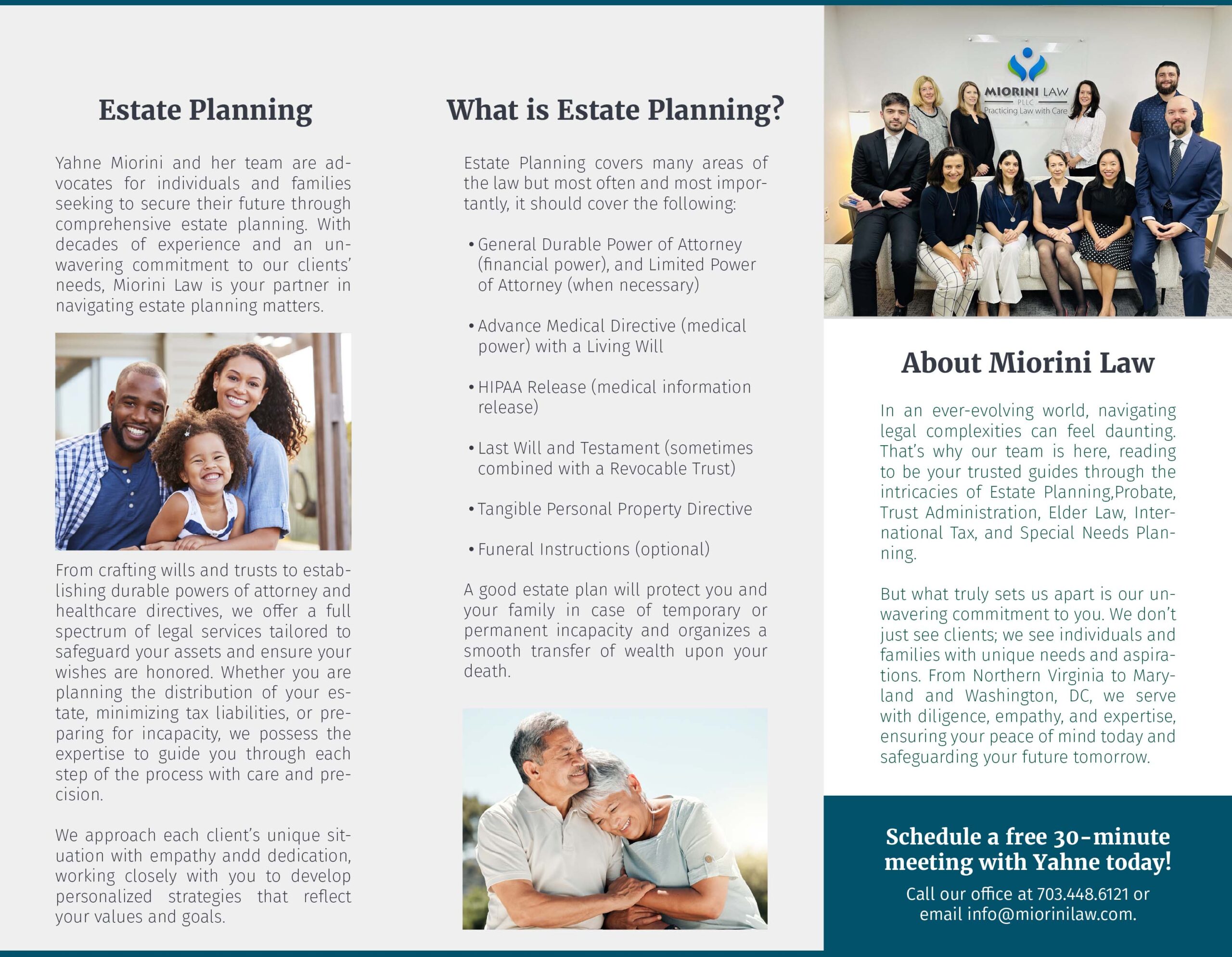
The firm needed professional print materials to support their client education and marketing efforts, as well as a complete website redesign. While they had an established logo, it existed only in raster format. I began by recreating the firm’s logo in Adobe Illustrator, and then developed a template for their marketing brochures.
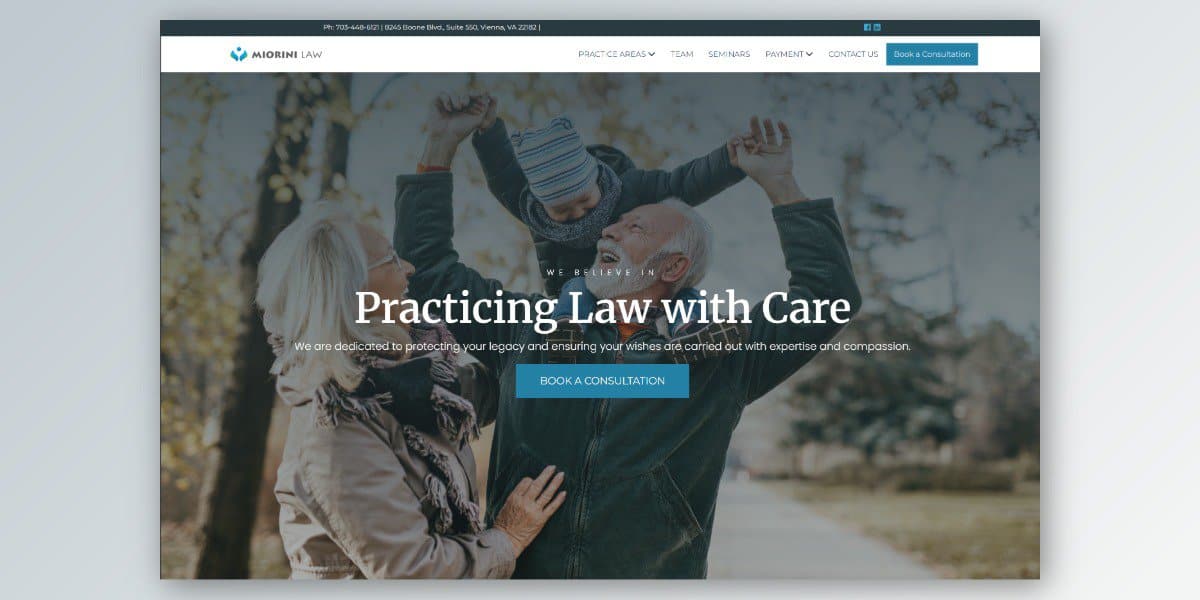
The aim to balance their professional, corporate positioning with the warm, human side of estate planning services. The aesthetic is very clean while maintaining a professional presence. The design incorporated photography of happy elderly couples and multi-generational families to soften the corporate edge while reinforcing the personal nature of their work.
The website redesign is still in progress.
The Process
The missing element in the existing brand was human connection. People who seek out estate planning and elder law services need to trust the team guiding them through complex decisions — navigating Medicaid and Medicare, protecting their assets, and securing their family’s legacy. Yahne Miorini and her team often work with clients during some of the most difficult moments of their lives, which makes establishing that human connection essential.
The project began with the brochures, which gave me a valuable opportunity to understand Yahne’s aesthetic sensibilities before moving into the larger website redesign. For both phases, I conducted extensive research into law firm branding, reviewing brochure designs and websites to inform the direction of each variation.
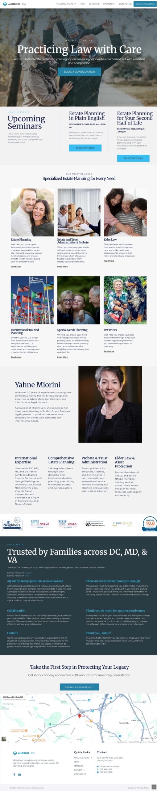
The engagement included a discovery meeting where we discussed marketing goals, business needs, and what the firm needed visitors to be able to accomplish on the site. We reviewed their existing website together and I identified plugins that would add the functionality they needed — including The Events Calendar plugin, which allows the firm to schedule and share their monthly seminars across social media and plan events for the entire year in advance, and an inline newsletter signup form embedded directly on the page, replacing a previous implementation that redirected visitors to a separate page.
From there, I developed three distinct design variations for both the brochures and the website, each with a different emotional tone. Some leaned more corporate, while others went deeper in feeling. For example, one variation used a richer, darker shade of blue paired with a photograph of a hand gently clasping the hand of an elderly person — conveying that this firm serves people navigating genuinely hard seasons of life. Ultimately, Yahne gravitated toward a lighter, warmer direction, selecting imagery of a happy couple in their 50s and 60s and a softer color palette — a choice that reflects the firm’s desire to feel approachable and hopeful rather than heavy.
For the website, I designed every section in multiple ways using Elementor Pro, saving each UI element to a modular library for easy mixing, matching, and modification. The client was given a week to explore and compare the variations before making their selection. Content was structured around the firm’s free service offerings — the primary calls to action being the free meet-and-greet consultation and the free monthly seminars — making it easy for visitors to find information, book consultations, make payments, and contact the firm.
Photography played an important role in the design strategy. I selected stock imagery to evoke warmth and reassurance, and I incorporated a team photo to help potential clients connect with Yahne and her staff as people, not just a business. One of my hero section mockups featured the team photo prominently for exactly this reason. Copy was drawn from the firm’s existing materials, with the expectation that they will develop new content for the final version.
The website is currently in progress, with responsive design underway. The client has expressed strong satisfaction with the direction — notably, Yahne had difficulty finding a designer whose style and brand sensibility aligned with her vision, and found that match in this collaboration.
Brochure
Website (in-progress)